$6 Flat-rate standard shipping // Free PDX pick-up at 3225 SE Division (Secret Room)
0 Cart
Added to Cart
    You have items in your cart
    You have 1 item in your cart
      Total

      News — Products

      Introducing The Living Things Series!

      We are super super excited to announce the launch of a new project we've been working on the past year with artists from Minneapolis and Providence to Edinburgh, Scotland. The Little Otsu Living Things Series is an ever-expanding collection of mini art books in which different artists each explore one idea based around the theme of living things. Our first two inaugural volumes are by Lizzy Stewart, whose theme is "A Guide to Eastern European Wildlife" (not to be taken too literally) and Jo Dery, who tackled the complexities of "Pheromones." They are both so amazing and totally different and we hope you will like these affordable and beautiful limited edition little art books as much as we do!

      Dan Black of Annual Planner fame was nice enough to help out with the cover design and he did an outstanding job of creating a cohesive look that will continue throughout the series. We have lots of great artists planned for the next year like APAK, Lilli Carré, Jessica Seamans, Hannah Waldron, Martine Workman, and Dan himself will be contributing an installment. We hope to bring you two different books on a quarterly basis so there should be a lot of different types of Living Things to go around. We may even offer a subscription to the series so that you don't miss out on any of the excitement.

      The official release date for the first two volumes is next Wednesday, but we should have some available at the SF store this weekend and Jo will be debuting her book on Saturday at the Brooklyn Comics Fest (which has an amazing line-up!) so stop by and pick one up directly from the artist herself. She'll be crashing at table 9 so be on the lookout for her eye-catching cover!

      A look at the LO Annual Vol. 5

      We're super excited to have volume 5 of the LO Annual Planner in-stock and ready to share with you! Here's a little tour...

      For Volume 5, we wanted to feature type as art so Dan hand-drew over 18 sets of type for a variety of characters. He also drew all the linework and details so there's no mistaking this for your run-of-the-mill planner.

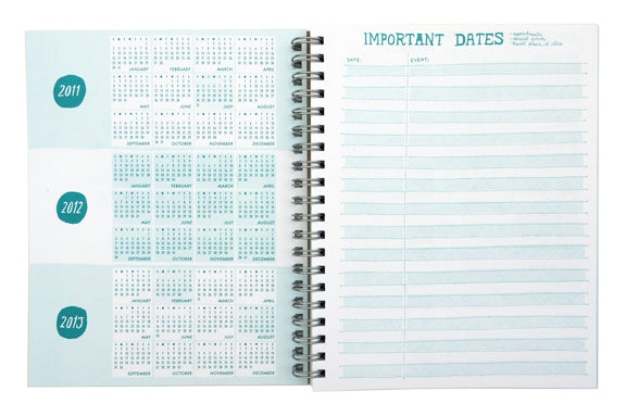
      We've included handy mini calendars for the next three years and a quick reference page for all your important appointments, travel, and events.

      Use the personal info page to consolidate all your medical, travel, car/bike details, and reminders for all your plethora of different user names and passwords. There's also a page for important addresses, a back-up phone list page for ease of use with your landline or in case you lose your cell phone, and a page to keep track of birthdays and gifts so you don't end up giving someone the same thing twice.

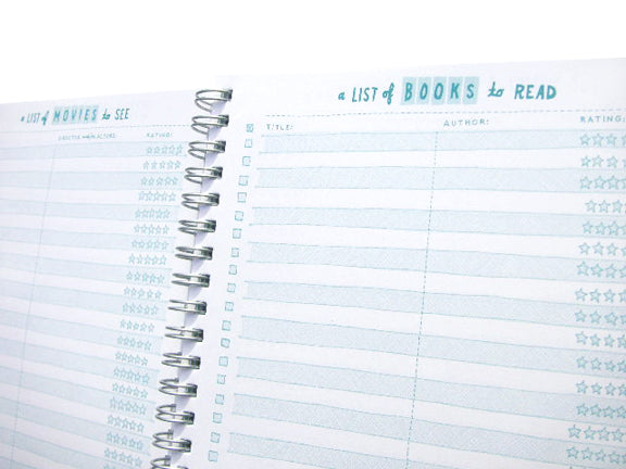
      Make a note of all the books, movies, music, and websites you want to check out on these specialized list pages so you don't forget about them later.

      There are 12 dateless month layouts so you get a quick overview of what's coming up this month and in the months ahead. There's plenty of room to write in each day plus a notes column for monthly to-dos and things to remember.

      And to top it all off, there are 54 dateless weeks with plenty of room for you to plan and record your week. Each day has a dotted column to the left that you can use for appointment times or checking off your daily to-dos. There's a large area for notes for the week and another gridded column that you can use for weekly to-dos and keeping track of things like expenses. We think it's our best weekly layout yet!

      It all comes printed with soy-based inks on 100% PCW recycled paper by our friends at 1984 Printing in Oakland to make this a great new addition to our planner family!

      Giving calendars a second life

      We love calendars here at little otsu and on any given year we have several different ones around our office. But we never know what to do when the year is over and we have to throw away--well, throw in the recycle bin--the old calendar and no longer get to enjoy the art. So when Jennie Smith came to us in 2006 with the idea to make a calendar that had a poster on the back so that you don't have to throw it away after the year was over, we knew it was kismet. We have used this as a central idea in all our calendars since.

      a view of both sides of Ron Rege's 2011 Calendar & poster

      Over the last four years Jennie, Lart, Chris and now Ron have made some pretty amazing posters on the back of their calendars. I've seen people in the sf store buy them specifically for the poster side as wall art. That said, we think of function as necessary in everything we make, even if art is paramount. We love the idea that something that is only temporarily functional like a calendar for a specific year can live on in a completely different way. It's almost like they are two different things at the same time, each to be enjoyed on their own even though it is one object. Certainly calendars are everywhere like your computer, iphone, ipad, ietc (i.e., the information is out there) and those are all great tools for knowing what day it is, but somehow it's more fun when Ron Rege draws it.

      So they are calendars that become posters and we used a functional form to represent that transformation--the fold-out aspect. People sometimes ask us about the folds and really it's what I was talking about with one thing becoming another. The opening of the folds physically transforms this small square into a large 18"x24" poster in front of your eyes and you are part of it. It also has the added value of making them easier to ship and store which is better for the environment and makes them less expensive to buy and sell. And seeing the folds on the calendar, while not an obvious advantage, is just a reminder of the transformation. I could be making too much of it--it is just a calendar--but it's nice to think of these things.

      poster side of Ron Rege's 2011 Calendar & Poster

      poster side of 2009 Treehouse Calendar by Jennie Smith

      poster side of Lart C. Berliner's 2009 Railways Calendar

      So riffing off the idea of giving calendars a dual purpose that started with the calendar/poster, when we made the 2008 calendar Through the Year with Gordon The Fox with John Porcellino, we thought of the idea of having all the calendar information on the bottom of each page and putting a dotted line on the cover so that at the end of the year you can cut off any and all calendar info and it becomes a spiral bound mini book with no trace of the calendar it once was.

      before and after the cut with John P.'s Through the Year with Gordon the Fox

      Eun-Ha from Milkly Elephant came to us with a great idea to create a postcard calendar where the postcards are perforated and can be torn off after each month is over. We made sure there was no calendar info on the back of each postcard so now you have an amazing postcard set. Poof, a second life!

      Milky Elephant postcard calendar is perforated for easy tearing

      With Chris Duncan's special "Two Years of the Youniverse" calendar, we made it two sided with a perforation so that after 2010 is over you can just cleanly tear off the calendar section and you're left with this amazing double-sided art print. We love the idea that calendars we made years (or a year) ago are still spending time in people's lives and on their walls as posters, prints, books, and postcards.

      Two Years of the Youniverse print by Chris Duncan

      SF Store: New Ron Rege Calendar/Poster

      Our new 2011 fold-out calendar & poster by Ron Rege, Jr. is now in our SF store (and will be available online next week)! Come check out its amazingness! It folds out to a whopping 18" x 24" and like one of those 3-D posters from the '90s, seems to reveal things to you the longer you stare at it. It was printed in Hayward, CA on 100% post-consumer recycled paper with vegetable-based inks and we are making a limited edition of 50 unfolded posters available only at the SF store, so act fast!

      front of calendar

      poster side for after the year is over

      close-up

      You Are Here: Maps As Influence

      Our friends and old neighbors Creativity Explored in San Francisco have a new art show opening April 15th called Where Are We? which takes the concept of maps as the basis of the exhibit:

      "This includes, but is not limited to, painting and drawing on maps, using maps as collage material, and drawing maps from scratch. While some of the artists working with this theme embrace the challenge of integrating maps into their oeuvres, others take a more individualized approach by creating maps of their home countries, while yet others use the topic of maps to explore fresh new subject matter."

      image from creativityexplored.org

      Maps have always had a strong influence on us with their combination of the artistic and the practical. They are a necessary part of getting from one point to the next--even now with online maps and GPS we live with maps more than ever--but they can also be beautiful and intricate and create not just a physical manifestation of where we live, but also another two dimensional world we wished we could live in.  They have always been part of our world view, a visual representation of Earth where we imagine ourselves going from tiny point to tiny point.

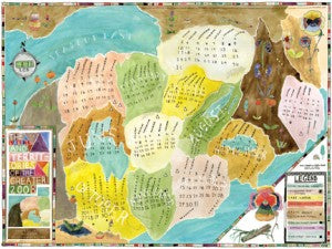
      Lart made two amazing projects based on maps: Lakes and Territories of the Greater 2008 and 2009 Railways. Both were a calendar on one side and a poster on the other, so that at the end of the year you could flip it over and have a poster with no indication that it was ever a calendar (we've always been bothered by how calendars basically become obsolete once the year is over and loved this dual use idea brought to us by Jennie Smith).

      LO36 calendar final web

      The Lakes and Territories of The Greater 2008

      LO36 calendar back web

      the back of Lakes and Territories

      The map drawings were created as a map to each given year, with the months as territories/states on one and subway stops on the other. It was a common thing in our store to have people ask "what is this a map to?" and not always understanding the answer of "the year 2009." Especially with how pervasive calendar dates are out there with your computer, iphone, etc, we thought it was nice to have a calendar that's not so straight-forward and forces you to stare at it a bit.

      LO75 7

      2009 Railways Map Calendar

      LO75 8

      the back of 2009 Railways

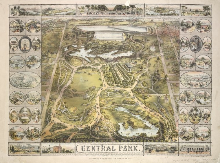
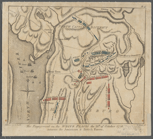
      The NYPL has another great exhibit (in the same space the Ehon exhibit was in) ending on June 26th that is based on maps called, Mapping New York's Shoreline, 1609-2009. We saw it when we were in New York last October and it was really great, almost overwhelming with how many maps there were. It was fascinating to see the way the city grew and changed, what geographic misconceptions existed, and the craftsmanship and artistry of old maps. On their revamped website they also have a Map Blog pulling things from their extensive map collection.

      Central Park Digital ID: ps_map_cd1_07. New York Public Library

      The engagement on the White Pl... Digital ID: 434803. New York Public Library

      images from nypl.org